

how to paint dark skin tones
Learn tried-and-true color combinations for painting skin tones on a monochromatic underpainting.
By Mario A. Robinson

While I find myself drawn to nature and other genres, I've focused my attention primarily on painting portraits of people. In my opinion, human beings are the most fascinating subjects to paint. Each person is endowed with a unique set of characteristics that distinguishes him or her from another. My work doesn't promote a stereotypical version of beauty. Rather, I place a premium on the depth of character my subjects possess. I enjoy the challenge of using watercolor to replicate the complexities of light, middle, and dark fleshtones.
A Strong Foundation
Watercolor requires the artist to identify and apply the lightest value accurately from the beginning of the painting process, because once a color is applied, it's virtually impossible to edit. In essence, there's very little room for mistakes.
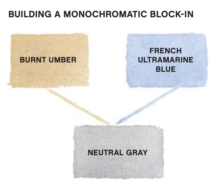
Regardless of how light or dark the subject's fleshtone is, I've found that one of the key elements for accurately painting skin tones is the use of a monochromatic block-in.
I begin each of my portraits by establishing the values of the model's skin tone by using a mixture of burnt umber and French ultramarine blue. This results in a mixture of neutral gray that I can modulate toward a cool or a warm temperature. It enables me to glaze multiple layers of color without having to make major adjustments in terms of value. I can just build them up gradually until I reach the darkest value in the painting. The monochromatic block-in serves as a foundation on which I can build. Below are some value tips for painting skin tones, followed by four demonstrations of light, medium, and dark skin tones.
Skin Tone Value Tips
Establish the values of your subject's skin tone by using a monochromatic block-in (see above). This will prevent your colors from becoming oversaturated with chroma as you build toward the darks.
Use thin, diluted glazes of paint to create luminous fleshtones; a glaze layer is at its best when the color is pure.Thick, opaque glazes can appear flat. Therefore, the thickness of the darkest mixtures of paint should be only slightly thicker than the initial glaze, ensuring that the dark layers are transparent and imbued with light.
Keep in mind that watercolor dries lighter than it appears when wet. Add more paint to your mixture to compensate for the change in value.
• Use the correct brush size to increase the likelihood of success. If the brush is too large, it can be difficult to control the flow of water in a particular area. If the brush is too small, it won't hold an ample amount of water, therefore increasing the probability of watermarks on the paper.
• Work from life as often as possible and practice painting under different lighting conditions, whether it's sunlight or a dimly lit interior. Understanding the effect of light, or the absence of light, upon a per- son's skin will help you when you're mixing paints for fleshtones.
• Avoid mixing more than three colors. This will result in a muddy appearance.
Light Skin Tone: Jillian

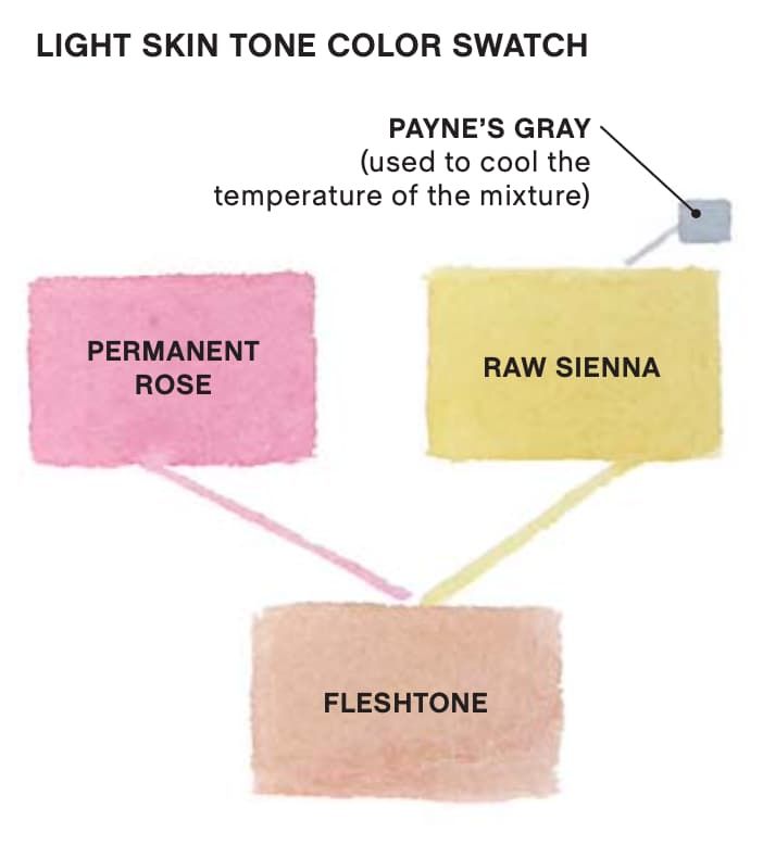
Every portrait executed in watercolor presents a distinct set of challenges. But painting light fleshtones requires a particular level of skill and restraint. It's of the utmost importance to identify the lightest tone when painting a portrait featuring a very light skin tone. I proceed with caution as I apply thin washes to establish values in the painting. And I apply a series of light transparent glazes rather than dark opaque layers to build form.
Glazing Over the Block-In
I glazed a layer of permanent rose, raw sienna, and Payne's gray over the monochromatic block-in, which is visible on the model's chest. There were both incandescent and natural light sources present in the room; therefore, I had to negotiate the effects of the warm and cool temperatures on the skin.
Prepping for More Paint
In preparation for a second pass of color on the skin, I wet the surface of the paper with clean water to keep the transitions soft before applying color. The model's skin is supple and free of deep wrinkles, so it was critical to prevent hard watermarks from forming. I deepened the shadow areas of the face by brushing in the mixture of paints used previously.
Next, I added warmth to the hair using burnt sienna, raw sienna, and neutral tint.
Adding Dark Colors
To identify the final value of the subject's skin tone, I darkened the hair, dress, and background. I added a pure glaze of Payne's gray to the eye sockets and a wet-into-wet application of indanthrene blue, sepia, and burnt sienna to the eyes. Applying clean water before brushing in color creates a soft effect instead of two opaque dots, which would appear unnatural.
As the dark colors began to give the face dimension, I applied a wash of cadmium red over select areas of the face and neck.
Suggesting Detail
I implemented a drybrush technique to add detail to the eyes using burnt sienna, indanthrene blue and sepia, as well as dimension to the cheekbone using cadmium red and Payne's gray, in Jillian.
Medium Skin Tone: LeAnn

I painted this portrait using a cool light to illuminate the subject. The light cooled the warm tones of the skin, as well as the shadows. Understanding how to use lighting effects when working with models can elevate the level of a painting.
I began by adjusting the temperature of the block-in for the painting based on the bluish cast of the light. I mixed burnt umber and a slightly greater amount of French ultramarine blue, which resulted in a blue-gray mixture. The subsequent layers of color are influenced by this initial decision.

Applying a Wash
After blocking in the middle and dark values with a blue-gray tone, I applied a thin wash of alizarin crimson, raw sienna, and Payne's gray (see the first set of swatches, above left) over the subject's face and neck. After the paint dried, I glazed a second layer over the eye sockets and the shadows on the right side of the face and neck.
Creating Value
I added a few of the darker elements to determine the proper value of the right side of the face, which was in shadow. I mixed burnt sienna and Payne's gray and covered the entire area of both eyes and the deep shadow on the side of her nose. I also applied a wet-into-wet wash of indanthrene blue, sepia and alizarin crimson to the hair. This set up the next stage, where I moved toward the darkest darks.
Creating the Illusion of Light
I wet the left side of the forehead and face with clean water prior to brushing in a glaze of cadmium red, cadmium yellow, and Payne's gray (see the second set of swatches, above right). Because the water diluted the paint, this created an illusion of light on one side of the face. After the paint dried, I darkened all the shadows on the face and neck using Payne's gray, burnt umber, and neutral tint.
Pumping Up Dark Values
I added darker values to the blouse and all of the surrounding elements; then I added the darkest darks to the eyes and hair. Next, I used a mix of indanthrene blue and sepia to drybrush finishing touches to the eyes and cheekbones to build form. I used the same two colors to embellish the darkest areas of the hair for LeAnn.
Dark Skin Tone: Safety Pin

I generally choose a cooler version of my monochromatic block-in when painting darker skin tones. Working over the cool color of the underpainting maintains a balance between the warm and cool tones of the flesh. There's an inclination to oversaturate darker skin with warm tones, but it's not necessary to work with excessively thick glazes. As layers are added, the light reflected off the paper is blocked, and the area becomes increasingly dark.

Creating Tone
Working light to dark, I added a first pass of color, which will be the tone of my highlighted areas. The first glaze of cadmium red, cadmium yellow, and Payne's gray (in the first set of swatches above) is evident in the light area on the model's left forearm. The mixture's consistency is thin; the paint is heavily diluted with water. I avoided the temptation of applying thick, opaque layers in the early stages to maintain a sense of light in the light and middle values.
Warming the Skin Tone
My second pass consisted of a mixture of burnt sienna, raw sienna, and French ultramarine blue (in the second batch of swatches above). This combination warmed the tone of the flesh, while the French ultramarine blue began to push the tones further toward the darker values. This glaze is visible most notably on the forehead and nose. I also added dark tones — indanthrene blue and sepia — to the eyebrows, hair, and the darkest shadow areas in preparation for the darkest darks of the skin.
Implementing Dark Tones
I added the darkest tones using a mixture of alizarin crimson, sepia, and indanthrene blue (in the third set of swatches above). I applied the mixture of colors in the previous step before adding the darkest colors. I moved around the face and arms, working wet-into-wet, which created soft transitions. I continued to glaze dark colors over dry layers to heighten the contrast between the white dress and the model's skin; this gives a greater amount of depth to the darks in Safety Pin.
Demonstration: Sam
This demo shows how I layer thin veils of color over the monochromatic underpainting to establish the light, middle, and dark values to create a delicate balance of warm and cool tones.

Step 1
I began by blocking in the mid- and dark tones using a mixture of burnt umber and French ultramarine blue. The mid-tones required two glazes, while the darks were achieved with three glazes. I also applied a wash to the background to eliminate the distraction of the white surface of the paper, which would affect my assessment of values. The glaze I used for the first few layers consisted largely of water and a small amount of paint.

Step 2
Once the block-in layer was completely dry, I wet the paper in the areas of the face that appeared lighter, such as the forehead, nose, and chin. At this stage, the underlying block-in is highly visible and provides a blueprint for subsequent layers. I then added the local color of the model's fleshtone, which was a mixture of permanent rose, raw sienna and Payne's gray.
As the model's skin became darker in the painting, I pushed the values of the hair by using sepia, burnt umber, and Payne's gray. This unified the two areas in preparation for the next step.

Step 3
I deepened the tones of the face using a glaze consisting of permanent rose, raw sienna, and Payne's gray. I was careful to wet the highlighted areas with clean water prior to adding color, which kept the transitions soft.
While the face was damp, I darkened the hair and worked around the hairline, using a wet-into-wet technique, to keep the edges soft. I added a mix of Payne's gray, burnt umber, and neutral tint to the background to unify the darker values.
Note: It's important to adjust the values of each layer until they properly relate to one another prior to advancing to the next one. Otherwise, it can become a game of cat and mouse if you're chasing a value in the effort to match it later in the painting process.

Step 4
I solidified the model's facial structure in key areas — the jawbone, beneath the nose and the eye area — by using darker colors in the shadow areas using a mix of Payne's gray and burnt umber. I also used a pure wash of permanent rose for the middle tones of the cheeks and other areas.
I used a drybrush technique to add detail to the hair, particularly near the temple and beneath the ear. It's important to note that the drybrush technique is more effective when used sparingly to avoid an overworked appearance in Sam.
Meet the Artist

Born in Altus, Oklahoma, Mario A. Robinson's artwork has a timeless and universal quality, while also exhibiting a turn-of-the-century aesthetic. You can find Mario's art featured in numerous publications, such as Artists Magazine,The Pastel Journal, andWatercolor Artist. Find more information about Robinson and his artwork at MarioARobinson.com and on his Instagram page, @marioarobinson.
A version of this article appeared in Watercolor Artist magazine.
You may also like:
- Fleshtones and Color Temperature
- 5 Quick Tips for Portrait Artists from Mario Robinson
- Video Download: Portrait Painting – Pastel & Watercolor on Paper with Mario A. Robinson
how to paint dark skin tones
Source: https://www.artistsnetwork.com/art-mediums/watercolor/painting-light-middle-and-dark-skin-tones-a-demo/
Posted by: almondtherlhe.blogspot.com
0 Response to "how to paint dark skin tones"
Post a Comment